The Design of Everyday Things
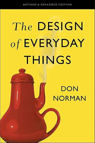
Why doors confuse you and interfaces blame you: the classic explanation of how design either guides people or quietly sets them up to fail.
The book's central idea
When you push a door that needs pulling, the failure is not yours. The design was wrong, because it did not communicate what it wanted you to do. Norman's whole argument grows from that reframing: confusion is usually information about the interface, not about the person.
This is why designers still call a badly-signposted door a "Norman door".
Affordances and signifiers
Two terms carry much of the book.
- Affordance: what an object makes possible. A flat plate affords pushing; a handle affords pulling.
- Signifier: the cue telling you where and how to act. A label, a colour, an arrow.
Good design makes the signifier match the affordance. Bad design puts a handle on a door that swings, then adds a "PUSH" sticker to fight the contradiction it created.
The seven stages of action
Norman models interaction as a small loop: forming a goal, planning an action, executing it, perceiving what happened, interpreting it, comparing it to the goal. Failure can occur at any stage.
The practical insight is that most errors happen at the seams between these stages — the user cannot tell what to do, cannot tell what happened, or cannot tell whether it worked.
The gulfs
- Gulf of execution. The user does not know how to do what they want.
- Gulf of evaluation. The user cannot tell what the system did.
Two bridges span them: better signifiers on the way in, and clearer feedback on the way out. Most interface improvements are one of these two moves.
Human error is a design problem
Norman rejects the idea that accidents come from careless people. Human error is normal; the question is whether the system assumed perfection.
Two categories matter:
- Slips — the right intention, the wrong execution. Typing the wrong key, turning the wrong dial. Prevented by constraints, sensible defaults and immediate feedback.
- Mistakes — the wrong intention entirely, usually because the mental model is wrong. Prevented by better explanation and clearer conceptual models.
Seven principles worth applying
- Make the state visible so users know what is happening.
- Use a good conceptual model and explain it.
- Make the action match the outcome — controls near what they affect.
- Give clear feedback soon after every action.
- Handle errors gracefully, allowing reversal rather than punishment.
- Use constraints that make incorrect actions impossible or hard.
- Design for the weakest user, not the expert who never looks.
Why it still matters
The examples in the book are objects — thermostats, stoves, aircraft cockpits — but the principles translated directly to software: visible system status, forgiving errors, consistent models, and controls the user can predict.
A fair critique
The book is repetitive, and the anecdotes are decades old. Some arguments have been absorbed so thoroughly into product culture that they now read as obvious — which is itself a sign of how well the reframing worked.
Read it for the vocabulary: once you can name signifiers, feedback and mental models, you cannot stop noticing where they are missing.
🔑 Key actionable ideas
- When people fail to use something, the design is usually at fault, not the person.
- An affordance is what an object makes possible; a signifier tells you where to act.
- The gulf of execution is knowing what to do; the gulf of evaluation is telling what happened.
- Most errors are slips (wrong execution) or mistakes (wrong mental model).
- Make system state visible and give feedback immediately after actions.
- Use constraints and reversal instead of blaming users for mistakes.
- Design for the weakest user, not the expert.
Who is this book for?
Anyone who builds anything people use — developers, designers, product managers — and anyone who has ever pushed a pull door.
Final verdict
A genuinely foundational book whose vocabulary has become standard. The examples feel dated, but the underlying analysis has aged extremely well.