Don't Make Me Think
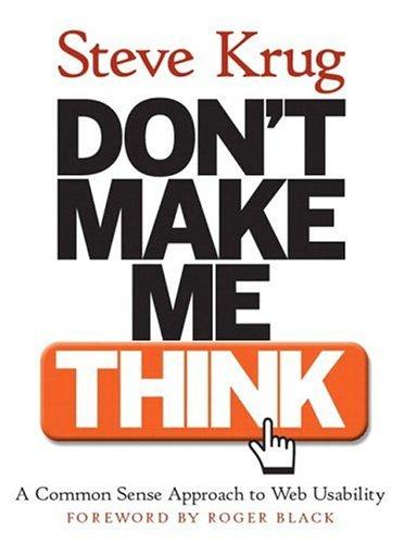
The short, friendly classic on web usability: why obvious design beats clever design, and how to test your site with real users on almost no budget.
The Core Idea
Krug's whole book rests on a test you can apply in a second: when a person lands on your page, does any part of them have to stop and work out what it means? Good design, he insists, is not decoration — it is the removal of tiny, avoidable moments of confusion. The title is the principle: a visitor should never have to puzzle over what a button does, where a link leads, or which of two similar labels is the one they want.
Thinking is expensive for someone who is busy, distracted and already unsure. Krug keeps that human reality at the centre and treats usability as a matter of respect rather than sophistication. He also writes the way he recommends designing — plainly, briefly, without showing off — which makes his arguments easy to remember and slightly hard to argue with once you have watched a real user struggle. Crucially, he assumes goodwill on the reader's side rather than expertise, so the book works even for people who will never run a formal study.
How People Actually Use the Web
Krug describes three facts of real behaviour that most design arguments ignore. We scan, hunting for words that match our goal and skipping almost everything else. We satisfice, grabbing the first link that looks good enough rather than weighing every possibility. We muddle through, rarely learning how things truly work and instead guessing, clicking and improvising. Design that assumes careful, patient reading is design for a user who does not exist anywhere outside a conference slide.
The Laws of Usability
A few rules have unusual staying power. Do not make me think. It does not matter how many times I have to click, as long as each click is confident and effortless. Get rid of half the words on each page, then get rid of half of what remains. These sound blunt, but each one removes friction rather than merely making things pretty. Applied honestly, they force a designer to defend every element that competes for attention with the thing the visitor actually came for.
Designing for Scanning and Navigation
The book gets concrete about layout. Create a clear visual hierarchy so the eye knows where to go first, break pages into clearly defined areas, make obvious what is clickable, and cut the visual noise that fights with the content. Navigation then answers the questions every visitor carries in silence: what site is this, what page am I on, and what are my main options? When those signposts are missing or vague, people do not explore — they leave, usually without telling you why.
Testing on a Tiny Budget
Perhaps the most useful chapter is the cheapest. You do not need a laboratory or a large budget. Watch three or four real people try to complete a task while you keep quiet and resist the urge to help. The problems you see will be obvious, repeated and fixable, and you will learn more in one afternoon than in weeks of internal debate. Fix the worst issues and test again, because usability is a loop rather than a launch checklist you tick once.
Accessibility, Goodwill and Honesty
Krug argues that many accessibility improvements simply make a site easier for everyone: clear labels, readable contrast, sensible structure and predictable behaviour. He also introduces the idea of goodwill, the small store of patience a visitor brings, which every unnecessary annoyance spends. His broader point is that websites should be honest about what they do, because tricks that win a click also destroy the trust that would have brought someone back. He is refreshingly honest that some design questions have no single right answer, and that testing beats arguing about them.
A Fair Critique
The book is intentionally short and beginner-friendly, so experienced designers will find some of it familiar, and its advice can read as opinionated rules rather than measured research. A few examples feel dated now that mobile screens dominate. Still, as a first book on usability it is close to perfect: fast to read, easy to apply, and unusually practical for something so brief.
🔑 Key actionable ideas
- If a user has to pause and interpret a page, the design has failed.
- People scan, satisfice and muddle through — design for that.
- Remove half the words, then remove half again.
- Clicks are fine when each one feels confident and obvious.
- Clear visual hierarchy beats clever visual effects.
- Navigation should always answer where am I and what can I do.
- Test with three real users; it costs almost nothing and teaches a lot.
Who is this book for?
Designers, developers, product people and anyone who owns a website and wants visitors to succeed without thinking about it.
Final verdict
Short, plain-spoken and relentlessly practical. The best first book on usability, even if its age shows in a few examples.